Reports
Three products, three sets of loyal coaches, one system to replace all of them
Hudl
Hudl, Volleymetrics, and BallTime each shipped their own volleyball reports, and coaches were fiercely loyal to whichever one they learned first. Over a year and 30–40 coach interviews, I designed the system that replaces all three — one layout system, three new components, built around coaches’ habits instead of against them.
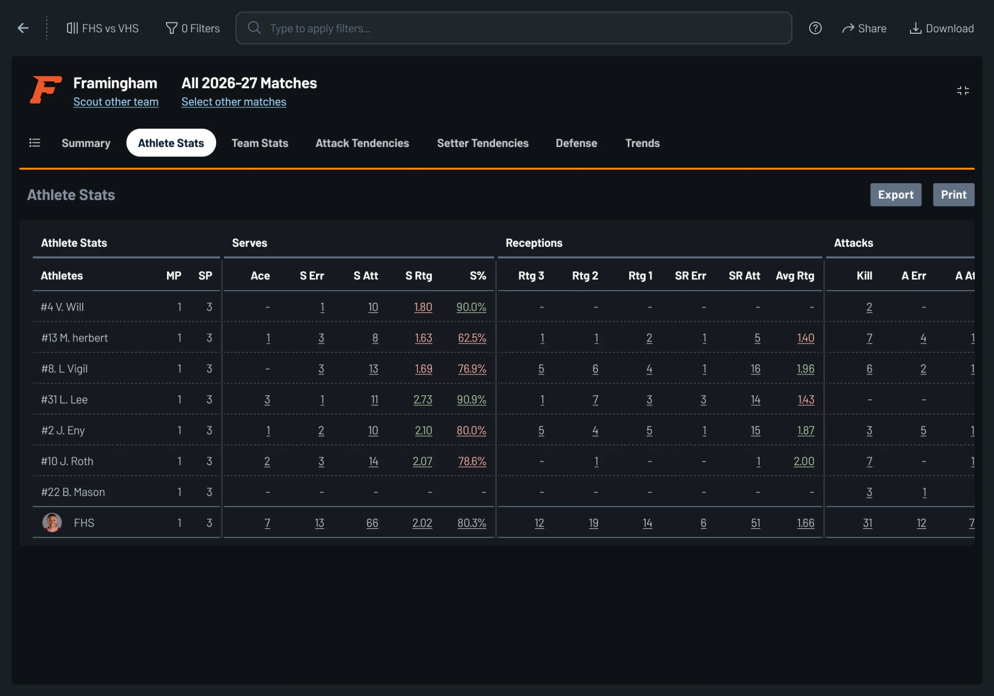
- Experience goal
- Make it feel like a report they already know.
- Business goal
- Three reporting systems into one.
- Timeline
- A year — constantly on and off the roadmap.
- Team
- 2 designers (me + a data viz specialist), 1 PM, 6 devs, 2 QA
The Big Question
How do you replace three reports coaches already love that are all a little different from each other with one system they’ll love more?
Coaches don’t start with video. They start with a report.
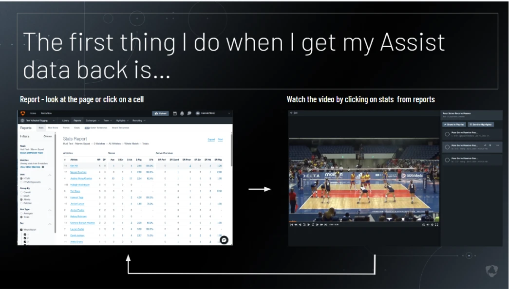
I talked to 30–40 coaches over a year, middle school through Olympic analysts. Reports kept sliding on and off the roadmap, so I used the delay to talk to as many coaches as I could — and it was easy to find users since coaches will always make time to talk about their favorite report.
Every one of them described the same loop that they did not like: Click a cell → find the clip → go back → lose your place → repeat.
The problem I didn’t want to repeat
Click a cell → find the clip → go back → lose your place → repeat.
They loved the data. They loved that the data got them to the video, but they didn’t like that it took them out of what they were experiencing — a report-first world.
Familiarity beats almost everything else
Coaches are loyal to what they know, and every change costs them something. But their loyalty wasn’t a reason to repeat the old reports’ mistakes. My PM and I turned the research into a ranked priority guide, so the team could settle tradeoffs without me in the room.
1. Path to action
Coaches don’t just read reports. They clean data and find video in them.
2. Familiarity
Years of muscle memory. Don’t spend it.
3. Interactive-ness
Data is better when the video is one click away.
4. Responsiveness
Athletes live on their phones. Hudl reports didn’t.
What already existed
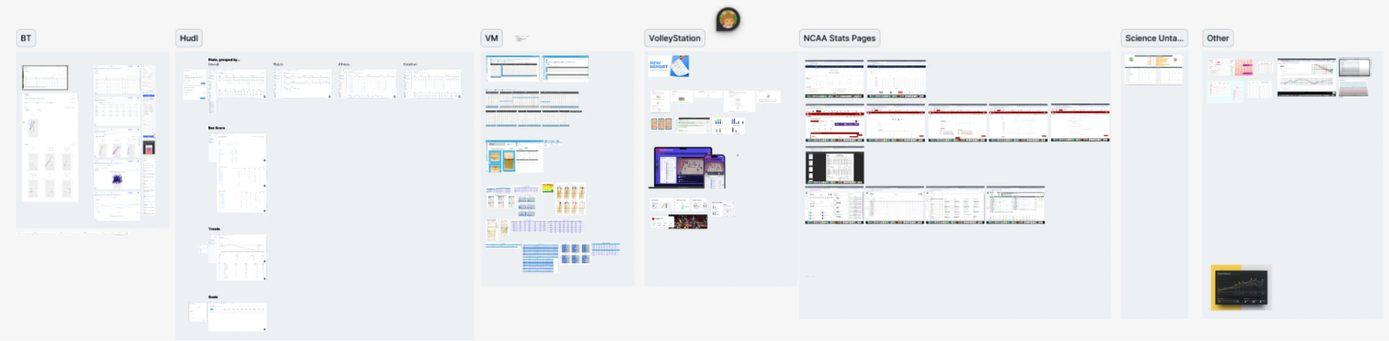
Where coaches look for reports
Before designing anything, I mapped where each product hid its reports — which nav slot, and what it was called. All three buried it in nearly the same place. So we left it there.
This was the key to keeping reports familiar, while adding new features and making some changes to layouts and components. How do you replace three reports coaches already love with one they’ll love even more? You keep their wayfinding the same—a lesson, unfortunately, we had to learn the hard way (more context below).

Three components, a header, and a layout system covered every report we had
Then I mapped every existing report and its flow, plus what competitors shipped, so anything we cut could come back as a planned fast follow instead of a surprise.
Everything we owed coaches collapsed into three components: a data table worth staring at, a location chart with lines and heat maps, and a trends chart that redraws on demand. A full report builder with more interesting displays of data and better usage of data and player tracking data needed more than that — those became follow-ups.
We built the system. We built the components. 2 mistakes almost cost us everything.
One we were forced into. One was an existing system that I advocated to change.
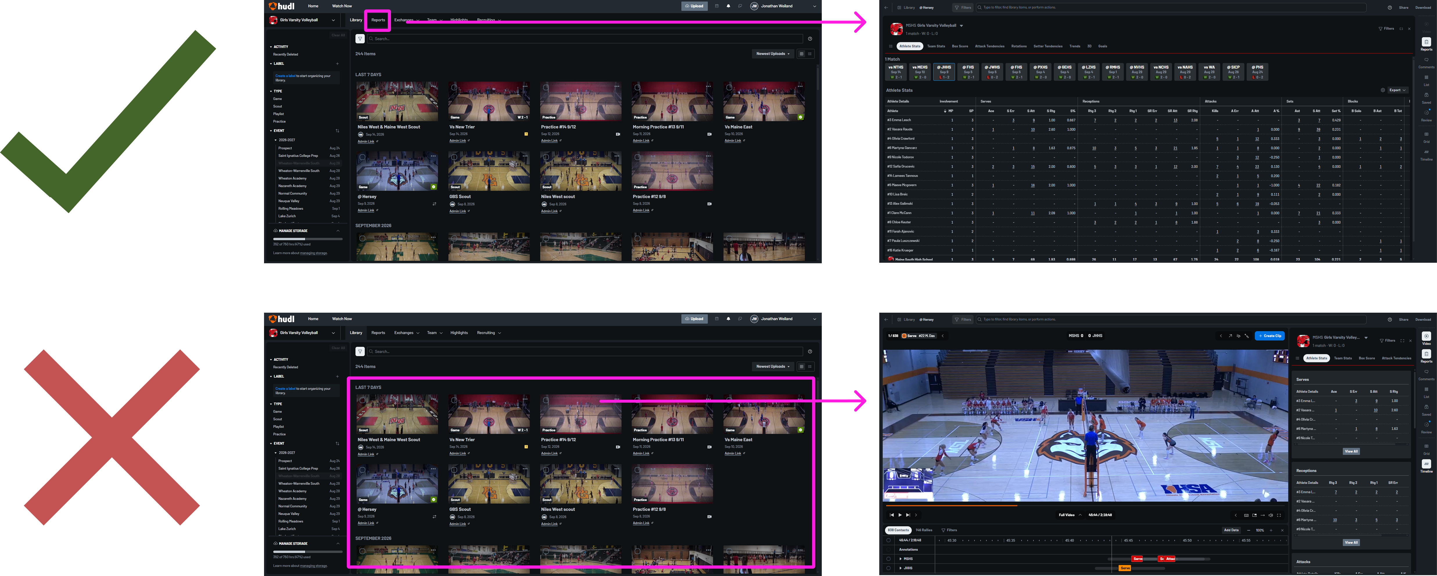
We shipped reports before they were ready. A new data system forced us into a video-first approach. User sentiment was rough...
We never meant to ship video-first. Another initiative needed that data pipeline that broke the old reports — in a way that we couldn't repair them so video-first went out early: pick your content, then see your numbers.
It turned into the clearest evidence we got all year that we could not be so video centric. Coaches didn’t adapt to it. They worked around it, and they told us so. What they wanted was the order the research had described from the start: open reports, see the most recent match, change the content from there.
Rerouting the Reports button to the new experience was always the plan. Not building the data foundation earlier was where we went wrong and caused us to be more reactive to report changes than we wanted to be.
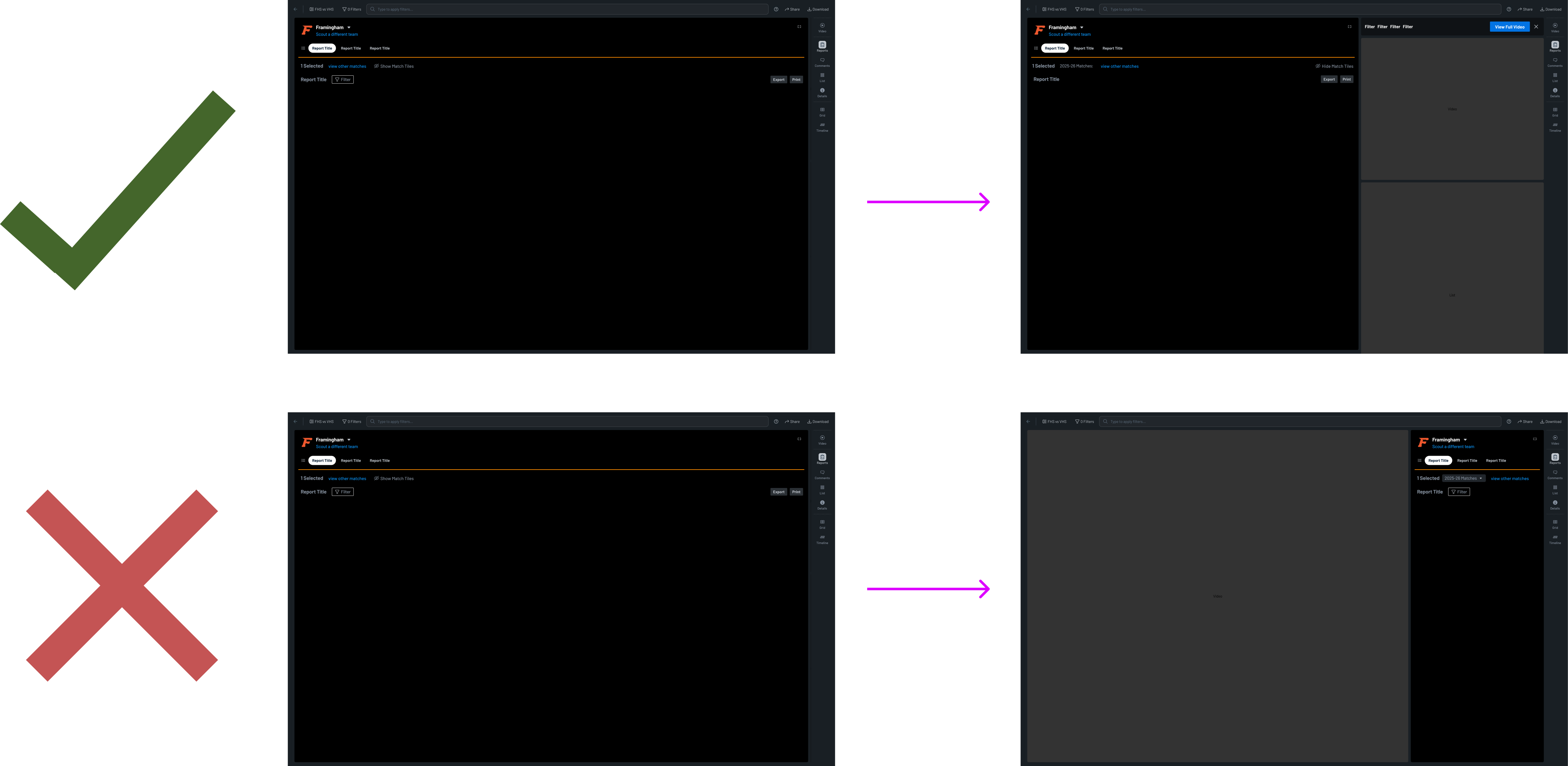
The existing layout system made reports too flexible
I pushed very hard to get this fixed. Our principal designer’s grand vision was a video and data experience that was modular and fluid. The system wasn’t working, and it was one of the core complaints from users. Based on my research, I knew how important it was to get rid of the report-to-video loop and instead have them in one experience. Our existing system did that, but it was only grounded in 1 of the 2 report -> data loop problem (the removal of the loop). It did not help users stay in the reports experience. It still forced them into a video first experience.
The fluidness of the system was forcing users to flip-flop between reports-first and video-first. The fluidness was too jarring.
So I argued to constrain the system. Sometimes a full-screen report should just be a full-screen report — no collapse, no side panel, no transition, even though the system made it possible. Full screen reports should be full screen reports with a hint of video. Full screen video should have a some reports.
Everything below is built on what those two cost us: let coaches start where they already start, and don’t move them once they’re there.
The system we built
Reports Header
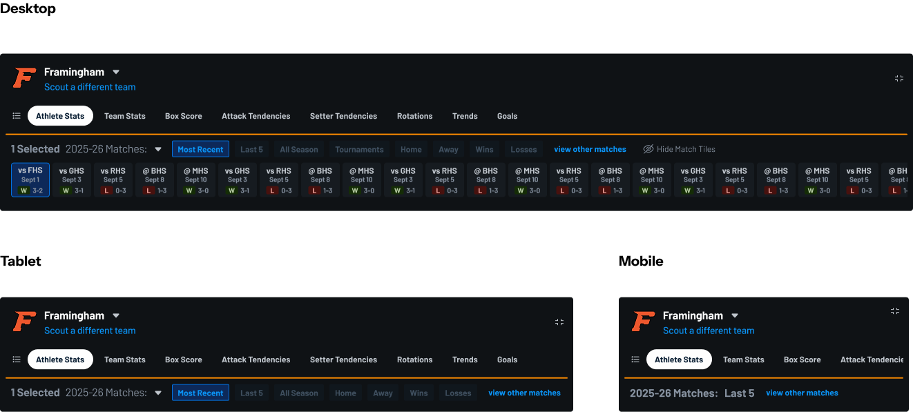
One header across every report
Tabs for report — in the same place all three old products put them. A coach opening the new system doesn’t hunt for the report they were use to using every day.
Multi-select match tiles were pulled from Volleymetrics because it was important to them, but given a show/hide option for Hudl and BallTime users who had mixed reactions. And multi-select scope works on every report, unlike the old reports so scope would be consistent across tabs.
Reports Layouts System
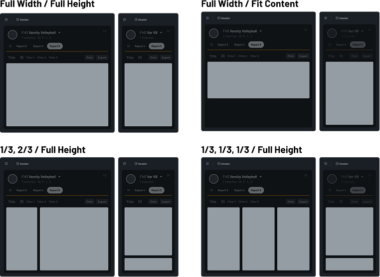
A layout system for consistent responsive behavior
We couldn’t rebuild every report for every sport, and other squads were about to start building their own.
So we defined a reusable layout system that had cards that would adapt to different screen sizes for consistent responsive behavior. And we made it easy to add more layout types. Volleyball needed 4 different layouts to account for all of the reports across BallTime, Hudl, and Volleymetrics.
Connecting Data to Video Without a Loop
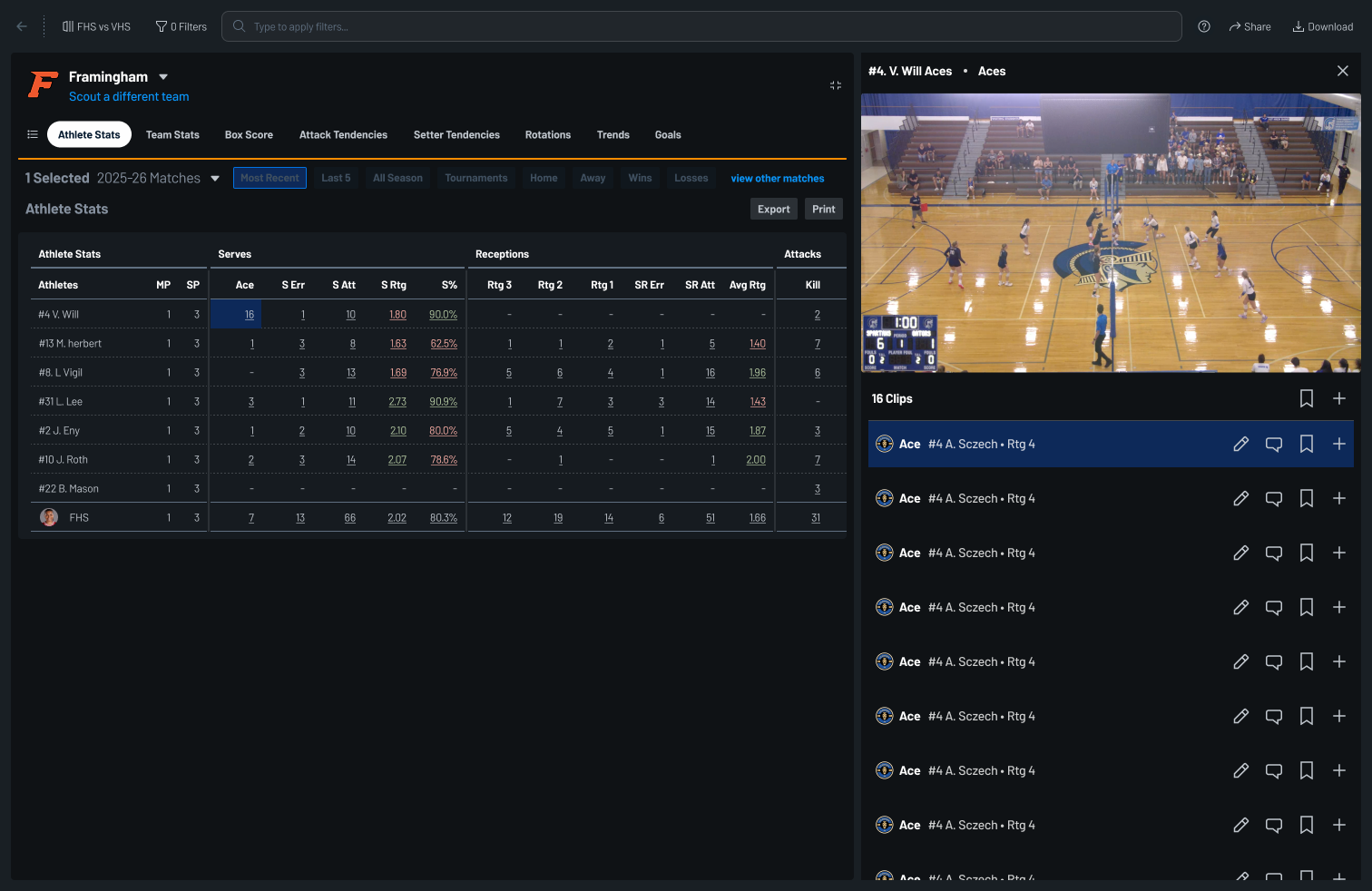
The table opens a side panel, not a new page
Click a count in the table and the clips behind it open in a panel beside the report — not a jump to another screen. The table stays put, the filters stay put, and the coach never loses the row they were on.
From that panel they can act on what they find: edit the clip, leave a comment, bookmark it, or add it straight to a playlist. Everything that used to mean leaving the report to reach the video — and then finding the way back — happens without leaving it.
New Components
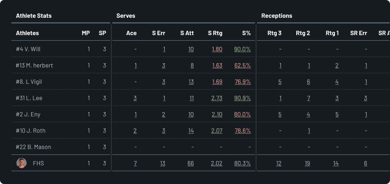
The data table
The same stats in the same shape coaches already read — but every cell is a door into the video behind it. Selections hold, so you can see what you’ve clicked and act on a set of cells instead of chasing one clip and losing your place on the way back.
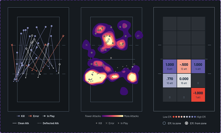
The location chart
Where the ball actually went: serve and attack lines, heat maps for the patterns a column of numbers can’t show. Click a hot zone, get the rallies that made it — which is the only reason a coach is looking at it.
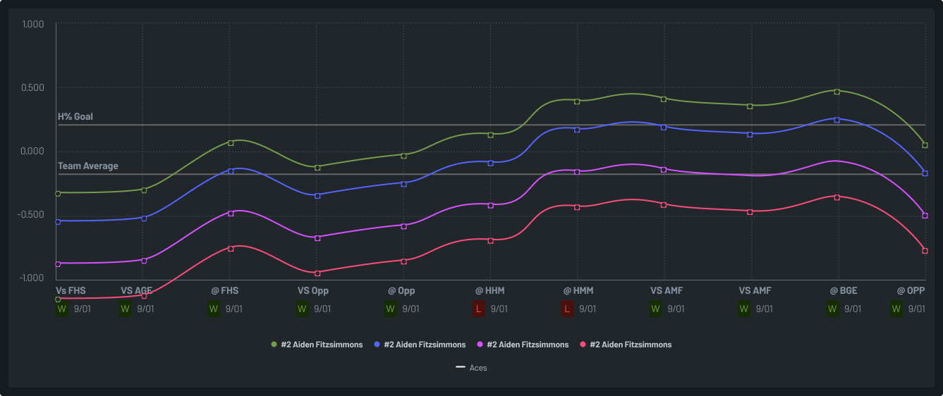
The trends chart
Is this getting better or worse? The question every coach asks after a match, answered across a season instead of a single game. Pick the stat, the grouping, the window — the same component covers a team’s side-out all year and one athlete’s last five sets.
The Final Product
Rather than screenshot the report, I rebuilt it here. The navigation is the coach’s starting point: which match, the filters over it, and the three things they do with a report once they have it — ask for help, send it to an assistant, take it away as a file.
| Athletes | ||
|---|---|---|
| Athletes | MP | SP |
| #4 V. Will | 1 | 3 |
| #13 M. Herbert | 1 | 3 |
| #8 L. Vigil | 1 | 3 |
| #31 L. Lee | 1 | 3 |
| #2 J. Eny | 1 | 3 |
| #10 J. Roth | 1 | 3 |
| #22 B. Mason | 1 | 3 |
| FHS | 1 | 3 |
| Attacks | ||||
|---|---|---|---|---|
| Athletes | Kill | A Err | A Att | A% |
| #4 V. Will | 2 | – | 6 | 0.333 |
| #13 M. Herbert | 7 | 4 | 17 | 0.176 |
| #8 L. Vigil | 6 | 2 | 14 | 0.286 |
| #31 L. Lee | – | – | – | – |
| #2 J. Eny | 3 | 5 | 16 | -0.125 |
| #10 J. Roth | 7 | – | 13 | 0.538 |
| #22 B. Mason | 3 | 1 | 7 | 0.286 |
| FHS | 28 | 12 | 73 | 0.219 |
| Serves | |||||
|---|---|---|---|---|---|
| Athletes | Ace | S Err | S Att | S Rtg | S% |
| #4 V. Will | – | 1 | 10 | 1.80 | 90.0% |
| #13 M. Herbert | 1 | 3 | 8 | 1.63 | 62.5% |
| #8 L. Vigil | – | 3 | 13 | 1.69 | 76.9% |
| #31 L. Lee | 3 | 1 | 11 | 2.73 | 90.9% |
| #2 J. Eny | 1 | 2 | 10 | 2.10 | 80.0% |
| #10 J. Roth | 2 | 3 | 14 | 2.07 | 78.6% |
| #22 B. Mason | – | – | – | – | – |
| FHS | 7 | 13 | 66 | 2.02 | 80.3% |
| Receptions | ||||||
|---|---|---|---|---|---|---|
| Athletes | Rtg 3 | Rtg 2 | Rtg 1 | SR Err | SR Att | Avg Rtg |
| #4 V. Will | – | – | – | – | – | – |
| #13 M. Herbert | 1 | 1 | 2 | 1 | 5 | 1.40 |
| #8 L. Vigil | 5 | 6 | 4 | 1 | 16 | 1.96 |
| #31 L. Lee | 1 | 7 | 3 | 3 | 14 | 1.43 |
| #2 J. Eny | 5 | 4 | 5 | 1 | 15 | 1.87 |
| #10 J. Roth | – | 1 | – | – | 1 | 2.00 |
| #22 B. Mason | – | – | – | – | – | – |
| FHS | 12 | 19 | 14 | 6 | 51 | 1.66 |
| Sets | ||||
|---|---|---|---|---|
| Athletes | Ast | BHE | Set Att | Ast% |
| #4 V. Will | – | – | – | – |
| #13 M. Herbert | 1 | – | 2 | 0.500 |
| #8 L. Vigil | – | – | 1 | 0.000 |
| #31 L. Lee | 22 | 1 | 26 | 0.846 |
| #2 J. Eny | 4 | – | 6 | 0.667 |
| #10 J. Roth | 1 | 1 | 3 | 0.333 |
| #22 B. Mason | – | – | – | – |
| FHS | 28 | 2 | 38 | 0.737 |
| Blocks | ||||
|---|---|---|---|---|
| Athletes | Solo | Assist | B Err | Total |
| #4 V. Will | 1 | 2 | – | 2.0 |
| #13 M. Herbert | 2 | 4 | 1 | 4.0 |
| #8 L. Vigil | 1 | 3 | 1 | 2.5 |
| #31 L. Lee | – | 1 | – | 0.5 |
| #2 J. Eny | – | 2 | – | 1.0 |
| #10 J. Roth | 2 | 3 | 1 | 3.5 |
| #22 B. Mason | 1 | 1 | – | 1.5 |
| FHS | 7 | 16 | 3 | 15.0 |
| Team Stats | ||
|---|---|---|
| Rotation | Pts | SO% |
| Rotation 1 | 14 | 66.7% |
| Rotation 2 | 12 | 69.2% |
| Rotation 3 | 11 | 53.3% |
| Rotation 4 | 9 | 40.0% |
| Rotation 5 | 12 | 47.1% |
| Rotation 6 | 11 | 41.6% |
| FHS | 69 | 51.6% |
| Attacks | ||||
|---|---|---|---|---|
| Rotation | Kill | A Err | A Att | A% |
| Rotation 1 | 6 | 2 | 14 | 0.286 |
| Rotation 2 | 5 | 1 | 12 | 0.333 |
| Rotation 3 | 4 | 3 | 13 | 0.077 |
| Rotation 4 | 3 | 3 | 11 | 0.000 |
| Rotation 5 | 5 | 2 | 12 | 0.250 |
| Rotation 6 | 5 | 1 | 11 | 0.364 |
| FHS | 28 | 12 | 73 | 0.219 |
| Serves | |||||
|---|---|---|---|---|---|
| Rotation | Ace | S Err | S Att | S Rtg | S% |
| Rotation 1 | 2 | 2 | 12 | 2.08 | 83.3% |
| Rotation 2 | 1 | 2 | 11 | 2.00 | 81.8% |
| Rotation 3 | 1 | 3 | 11 | 1.91 | 72.7% |
| Rotation 4 | – | 3 | 10 | 1.80 | 70.0% |
| Rotation 5 | 2 | 1 | 11 | 2.18 | 90.9% |
| Rotation 6 | 1 | 2 | 11 | 2.09 | 81.8% |
| FHS | 7 | 13 | 66 | 2.02 | 80.3% |
| Receptions | ||||||
|---|---|---|---|---|---|---|
| Rotation | Rtg 3 | Rtg 2 | Rtg 1 | SR Err | SR Att | Avg Rtg |
| Rotation 1 | 2 | 3 | 3 | 1 | 9 | 1.67 |
| Rotation 2 | 3 | 4 | 2 | 1 | 10 | 1.80 |
| Rotation 3 | 2 | 3 | 2 | 1 | 8 | 1.63 |
| Rotation 4 | 1 | 3 | 3 | 1 | 8 | 1.44 |
| Rotation 5 | 2 | 3 | 2 | 1 | 8 | 1.63 |
| Rotation 6 | 2 | 3 | 2 | 1 | 8 | 1.75 |
| FHS | 12 | 19 | 14 | 6 | 51 | 1.66 |
| Sets | ||||
|---|---|---|---|---|
| Rotation | Ast | BHE | Set Att | Ast% |
| Rotation 1 | 6 | 1 | 8 | 0.750 |
| Rotation 2 | 5 | – | 6 | 0.833 |
| Rotation 3 | 4 | – | 6 | 0.667 |
| Rotation 4 | 3 | 1 | 6 | 0.500 |
| Rotation 5 | 5 | – | 6 | 0.833 |
| Rotation 6 | 5 | – | 6 | 0.833 |
| FHS | 28 | 2 | 38 | 0.737 |
| Blocks | ||||
|---|---|---|---|---|
| Rotation | Solo | Assist | B Err | Total |
| Rotation 1 | 2 | 3 | 1 | 3.5 |
| Rotation 2 | 1 | 3 | – | 2.5 |
| Rotation 3 | 1 | 2 | 1 | 2.0 |
| Rotation 4 | 1 | 3 | 1 | 2.5 |
| Rotation 5 | 1 | 3 | – | 2.5 |
| Rotation 6 | 1 | 2 | – | 2.0 |
| FHS | 7 | 16 | 3 | 15.0 |
| Athlete | Attacks | |||||
|---|---|---|---|---|---|---|
| Athlete | MP | SP | Kill | A Err | A Att | A% |
| #4 V. Will | 1 | 3 | 2 | – | 6 | 0.333 |
| #13 M. Herbert | 1 | 3 | 7 | 4 | 17 | 0.176 |
| #8 L. Vigil | 1 | 3 | 6 | 2 | 14 | 0.286 |
| #31 L. Lee | 1 | 3 | – | – | – | – |
| #2 J. Eny | 1 | 3 | 3 | 5 | 16 | -0.125 |
| #10 J. Roth | 1 | 3 | 7 | – | 13 | 0.538 |
| #22 B. Mason | 1 | 3 | 3 | 1 | 7 | 0.286 |
| FHS | 1 | 3 | 28 | 12 | 73 | 0.219 |
| Setter | Setting | |||||
|---|---|---|---|---|---|---|
| Setter | MP | SP | Ast | S Err | BHE | Ast/Set |
| #31 L. Lee | 1 | 5 | 45 | 3 | 1 | 9.00 |
| #2 J. Eny | 1 | 5 | 8 | 1 | – | 1.60 |
| #10 J. Roth | 1 | 5 | 2 | – | 1 | 0.40 |
| #13 M. Herbert | 1 | 5 | 2 | – | – | 0.40 |
| #8 L. Vigil | 1 | 5 | 1 | – | – | 0.20 |
| #4 V. Will | 1 | 5 | – | – | – | – |
| #22 B. Mason | 1 | 5 | – | – | – | – |
| FHS | 1 | 5 | 58 | 4 | 2 | 11.60 |
Impact
It's a bit too early to have hard numbers on sales impacts. Early sentiment was not good because of the navigation issues we faced due to data pipeline factors out of our control. But now that we're past the wayfinding problems and users can navigation to their reports by clicking a tab in the top navigation, there's an excitement from users about being able to edit from reports. Repeated interactions about the amount of time they're saving because we ended the report -> video loop and put it all on one screen.